
Homepage Change Log
Homepage Change Log 02: Turning the Background into a Site-wide Layer
The homepage background eventually became a global atmosphere layer. The important part was not reusing an image, but managing the image, overlay, theme switch, and readability in one boundary.
Contents
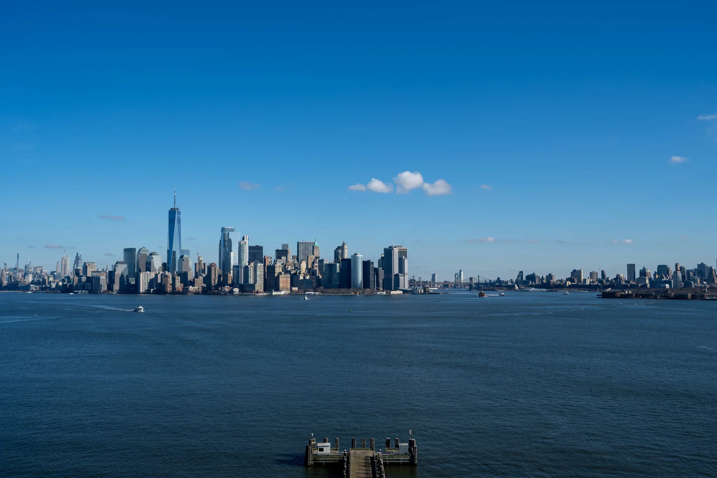
After adding the New York waterfront background to the homepage, it became clear that the image should not belong only to the homepage. The header floats across the whole site, and the pages should share the same atmosphere. Otherwise, moving from the homepage to the blog or gallery feels like entering a different space.
So I moved the background out of the homepage and into the locale layout.
Why Not Repeat It on Every Page
If every page renders its own background, a few things can drift:
- Image paths get scattered across files.
- Light and dark overlays can become inconsistent.
- Page transitions can remount the background layer and cause visible flicker.
Now the background is rendered once:
// src/app/[locale]/layout.tsx
<Providers messages={messages} locale={locale}>
  <GlobalBackground />
  <div className="relative z-10 flex min-h-screen flex-col">
    <Header />
    <main>{children}</main>
    <Footer />
  </div>
</Providers>
The content sits on z-10, while the background sits on z-0. Every page receives the same image and the same overlay.
Two Images, Not a Dynamic src
Like the calligraphy bird, the background has separate light and dark assets:
<Image
  src={assetsConfig.hero.background.light.src}
  className="absolute inset-0 h-full w-full object-cover dark:hidden"
/>
<Image
  src={assetsConfig.hero.background.dark.src}
  className="absolute inset-0 hidden h-full w-full object-cover dark:block"
/>
This does not use a single Image that changes src. A theme switch should not wait for a network request. Both images are present in the DOM, and CSS decides which one is visible.
The Overlay Matters More Than the Image
The background should provide atmosphere, not compete with the content. Readability mostly comes from the overlay:
<div className="absolute inset-0 bg-[var(--background)]/70 dark:bg-[var(--background)]/82" />The light theme keeps a little more of the sky and water visible. The dark theme uses a stronger overlay so text and borders do not sink into the image.
This is also why sections like recent notes, recently played, and recent photography still need their own panels. The background is the environment. The panel is the reading surface.
How Article Images Should Be Managed
If future posts need illustrations, I would split images into two groups:
- Article screenshots, diagrams, and process images should live on R2, ideally under a future
zjBlogorzjArticlesprefix. - A small number of fixed UI assets should stay in
public/images, such as favicons, global backgrounds, and Hero images.
In other words, ordinary article images should not pile up in the repository. They are public static assets, just like photography and calligraphy images, so R2 is the better place for them. MDX can reference the public URL directly:
For posts with many images, it would be useful to keep a small manifest that records the source file, processed asset, R2 key, public URL, and intended use. A future local console could turn that into an article-image upload workflow.
Takeaway
Moving the background into a global component made the site feel more unified and made the code simpler. More importantly, it created a boundary: site-wide visual assets should be managed by the site-wide layer, not owned temporarily by one page.